C&G's Guide to 2019's Key Colour Trends
If you’re planning to update the style of your home or investment property in the coming year, keeping abreast of current trends may help inform your design decisions. In today’s blog, C&G unpack the Pantone Colour Institute’s Colours of the Year, and suggest ways to incorporate them into your home design.
PANTONEVIEW Home + Interiors heroes two colour palettes specifically chosen for home and interior design. Whether you’re a stickler for trends or you’re planning a full design overhaul of your home or investment property, being aware of the hot colours for the year ahead will set you ahead of the curve in the style stakes.

Palette 1 – Cravings
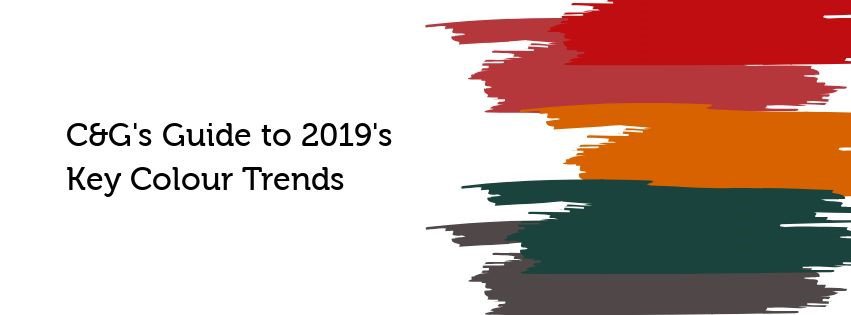
Alluding to seductive ‘fetish foods’ according to Pantone, the Cravings palette includes a spicy mix of warm reds, flamingo oranges and rich purples to lift any space. Featuring a cooling spritz of dark green, the palette as a whole has a Mediterranean feel when weaved into kitchens and dining zones.
We scouted some of our favourite interior sites for some pieces to get you started:
Bubble Cushion Cover in Rosette from West Elm
Flame Rug from West Elm
Melamine Tableware from Pottery Barn
Tealight Holder from Target
Sofa from Ikea
Green Tray Table from Ikea
Red Sea Wall Art from Coco Republic

Palette 2 – Classico
As its name would suggest, Classico plays on much more neutral, muted tones to create an effortless aesthetic of slate, grey, charcoal and off-blue hues. Perfect for coastal feel decor or an uplifting take on a minimalist bathroom, the Classico palette will be one to take you through season after season.
We scouted some of our favourite interior sites for some pieces to get you started:
Slate Place Mats from West Elm
Decorative Bowls from Target
Velvet Cushion from Target
Ethereal Landscape Wall Art from Coco Republic
Bedding by Sheridan
Vase by Australian Home & Garden
Discover more about this year’s colour heros here.

